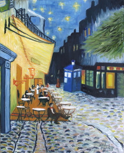
 In light of the Doctor Who 50th Anniversary Special I thought I would do a fun painting to go along with my Starry Night in Gotham painting. Tell me what you think!
This is my version of Cafe Terrace at Night by Van Gogh with Doctor Who. There has been a good response to to Starry Night in Gotham that I painted when I was 16 years old. So I thought I would do more for the series. This is what I came up with. I love Doctor Who so it was only natural to want to do a painting about it.
2 Comments
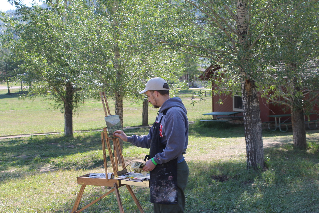
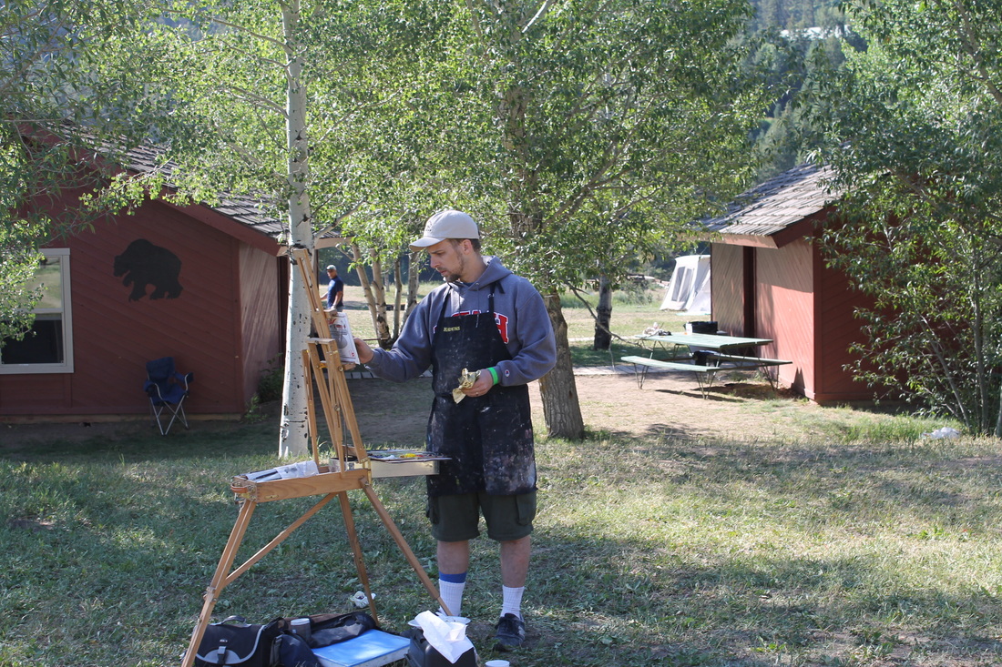
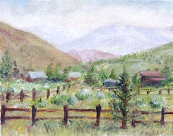 Another quick Plein Air. This was paint just outside of Jackson Wyoming at Teton High Adventure Boy Scout Camp. I woke up early in the morning before the boys woke up. I painted this in about 2 1/2 hours before we packed up and went home after 4 days at the camp. The camp director liked it so much she took it off my hands. I was happy that it would be with someone that would appreciate it. Tell me what you think. Here are some pics of me painting is as well for your enjoyment... 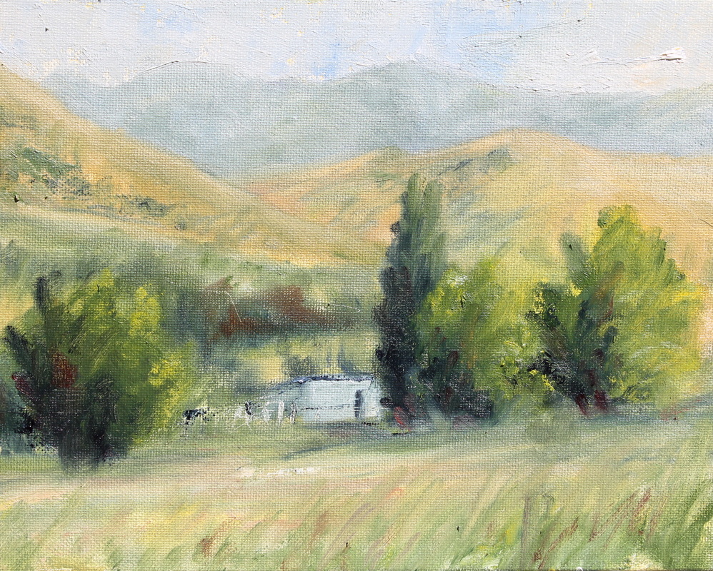 I went to a campout for my local church. My main goal was to at least get one plein air painting done while I was there. I woke up bright and early to get something done. This was the result.
It is 8x10 on canvas board done in oil paint. It took me a little less than 2 hours to paint. I had to get it done before we were kicked out of the camp ground. They had a wedding that needed the space right after we left. I tried to make myself in conspicuous so I would not draw to much attention so I could get it done. I did get a few visitors which are always welcome and I think I did a good job. Tell me what you think. http://www.nikenglishart.com/still-lifeplein-air.html This is a blog I have been thinking about for a while. Many people have asked about my process. Well I tried to document this painting as much as I could to answer all your questions. 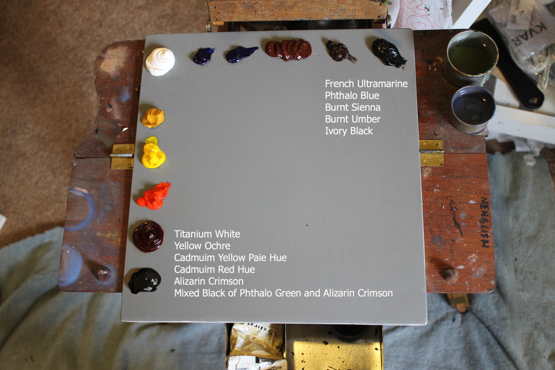 My pallet consists of these colors. Click on the picture if you want to know what paint colors I use. I have a warm and a cool color of each of the primary colors. I play with substituting the cool blues. I am not in love with Phthalo Blue because it is really potent and tends to take over the painting if you over use it. My favorite color is Burnt Sienna but is has be the "Winsor and Newton Artist Colour" brand. It has a little bit more of an orange to it. I really like the way it paints. 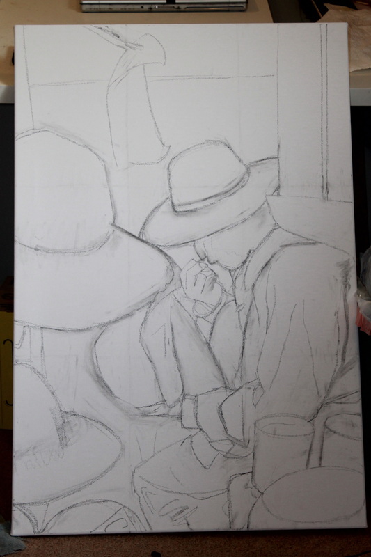 On most of my paintings I will sketch out the basic idea in charcoal of where things are supposed to be in the painting. Sometimes I will just paint it in with a very light wash. I keep in mind concept, proportion, layout and try to plan out what the over all look of the painting will feel like. Believe it or not this is one of the most important steps in my opinion. If I don't get the drawing done correctly it will make later steps take a lot more time. Also important thing to mention is that I try and wipe/rub off as much of the dust and charcoal as I can so it will not mix in to much with the paint. 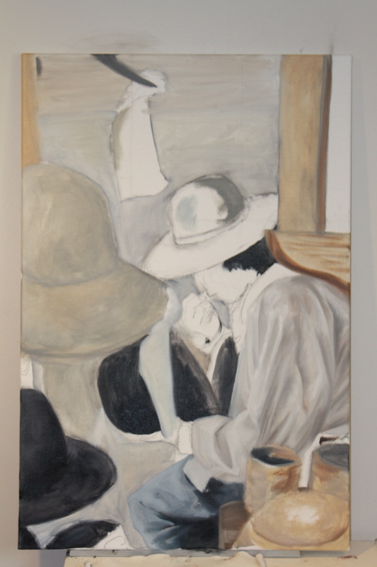 Next I start underpainting. Most of this stage is trying to posterize the picture, meaning I try and find the lightest lights and darkest darks on the canvas. That way I can judge what the rest of the paintings colors and values. This can also be considered the toning phase. Many artists will tone the entire canvas before they even start. I do this occasionally but due to the fact I do a lot of underpainting I usually "tone" in sections I dont do it all in one color. I only tone the whole canvas when I paint plein air or paint outside. 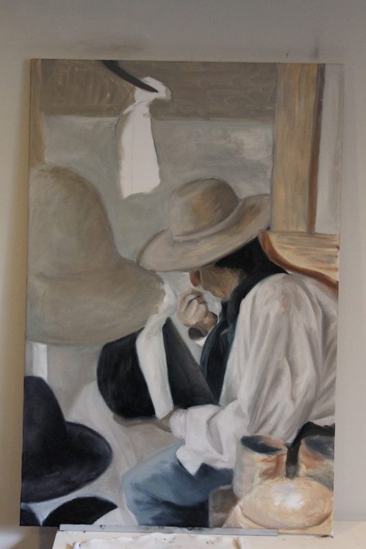 The next stages are more or less just working in half tones. and making sure the value is correct. I work and getting those lights and darks more noticeable. All the while always looking at making sure the drawing is still correct. As you may have noticed I did not get the ellipse on his hat correct in the original drawing. It was a struggle I had to deal with during the entire painting. I have to make sure all the solid colors are down before I start putting in small details. 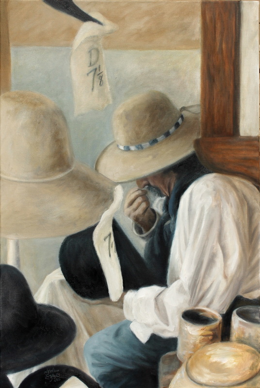 There really should be one more picture between these 2 pictures. After I have all the colors down and I make sure that the drawing is still correct. I add all the details. The values on his face. The highlights are lighted to make sure everything turns and the little brushes come out. As I am looking at this painting while righting this blog I now think I need to lighten up the tag on the hat above his head. I am going to go do that. 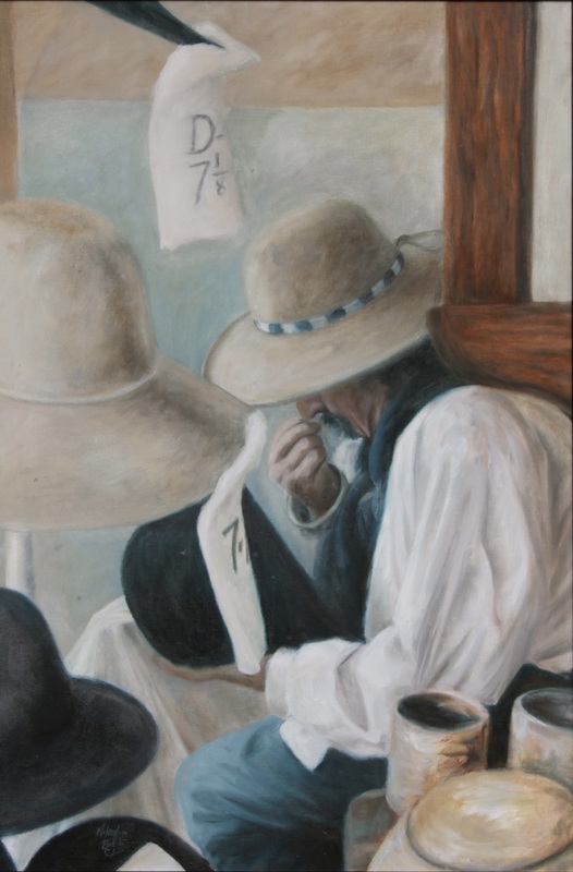 Here is the final product. Please leave comments either here or on facebook and tell me what you think of this post. Sorry I am not a great writer.
I just made a new page on Facebook for my Art. I am a little overwhelmed by how many people have commented on some of my art work. I hoped that people would like the picture of the Salt Lake Temple on Temple Square. It does touch home to a lot of people. It stands as a source of inspiration in one way or another to many people all over the world.
I had a good time painting it but it was a little of a pain. There are so many spires lines and interesting nooks and crannies it makes it very cumbersome to my silly mind. I really enjoyed the challenge but due to the response I have had from the painting I might have to do another. |
Nik English
The Artist of this website Archives
November 2013
Categories
All
|
 RSS Feed
